Component Overview
Component reference is helpful for you to implement layouts, elements, and components, using our CSS class and modifiers. Each page provides you with comprehensive usage instructions, examples, and guidelines.
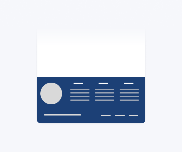
The footer contains supporting information for your service at the bottom of your website. All .gov.kh digital services shall contain a Global Footer Bar across all pages. The Global Footer Bar should include the name of the digital service, contact information, a privacy statement, and the terms of use.
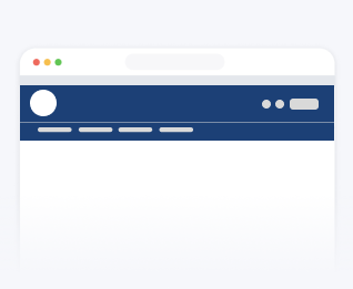
This component is the primary means that your users will use to navigate through your portal. It includes horizontal navigation and branding to identify your site.
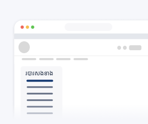
The side navigation is used to display a list of links to move between pages within a related category. It is used as a secondary form of navigation where the primary navigation is located hierarchically above the page frame.
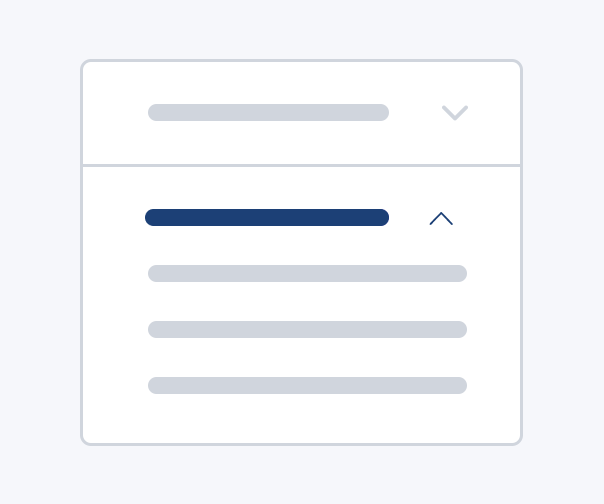
Badges can be used to highlight important bits of information such as labels, notifications, and status.
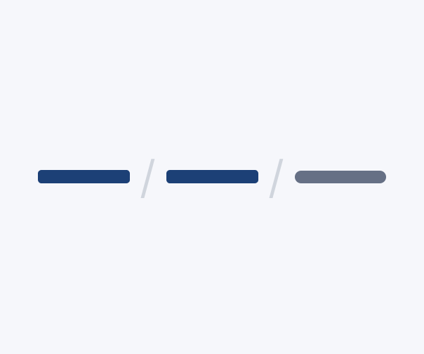
Breadcrumbs help users navigate and understand where they are on the current website or service.
Buttons communicate actions that users can take throughout your portal, which can be used in places such as modals, forms, and cards.
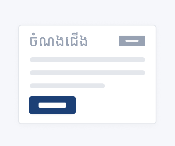
Cards can be used for headers and footers, a wide variety of content, and contain contextual background colors and images.
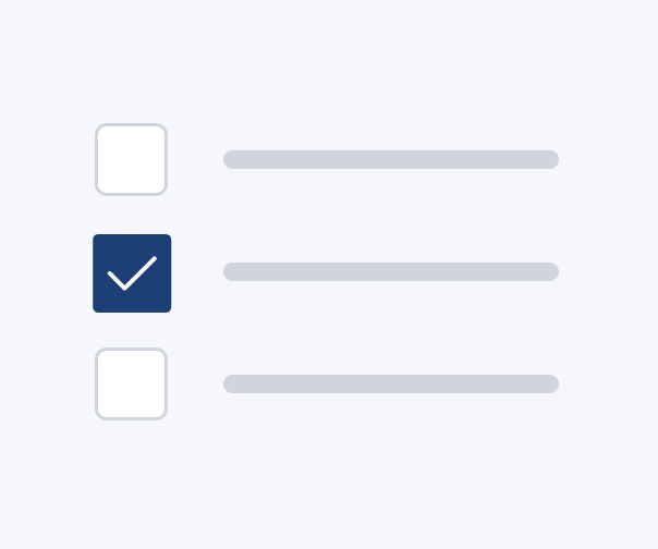
This component is used when you require users to select multiple items from a list.
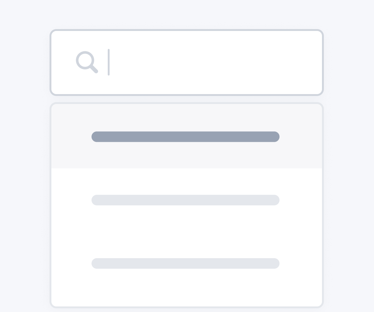
This component is used when you require users to make one or more selections from a list.
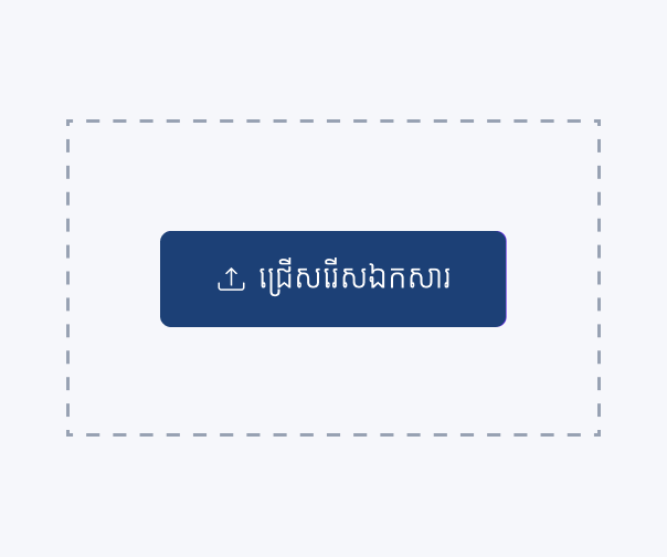
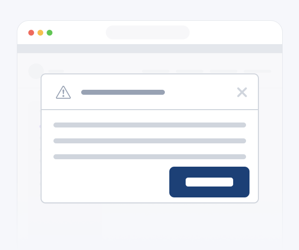
The modal component inform users about a specific task and may contain critical information which users then have to make a decision. E.g Accepting the T&Cs during signup
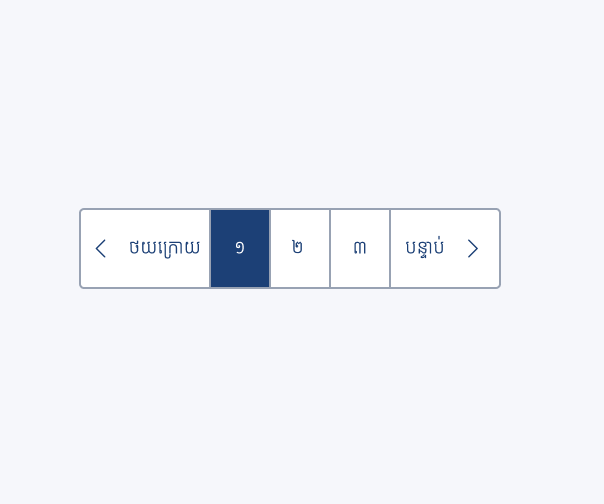
The pagination component is used to display a list of page numbers for your users, so that they can navigate to the next or previous page.
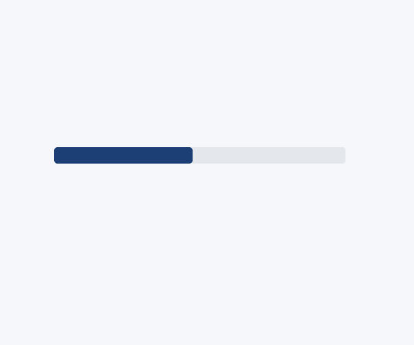
Provide up-to-date feedback on the progress of a workflow or action with simple yet flexible progress bars.
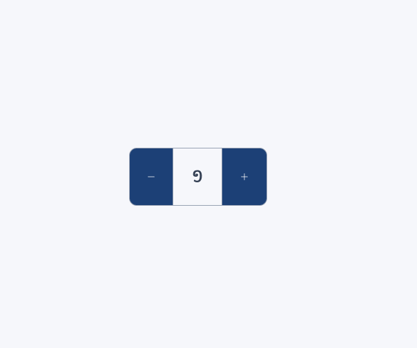
The quantity toggle component is used to increase or decrease an incremental venue, usually best used when the user needs to enter or adjust the quantity of a selected item.
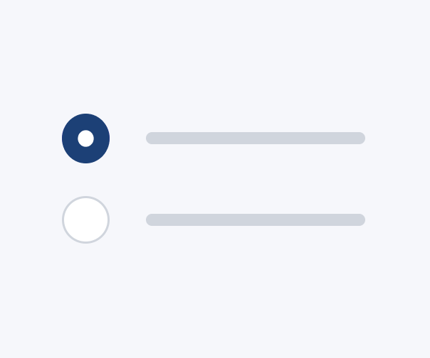
Radio buttons allow the user to select one option from a set while seeing all available options.
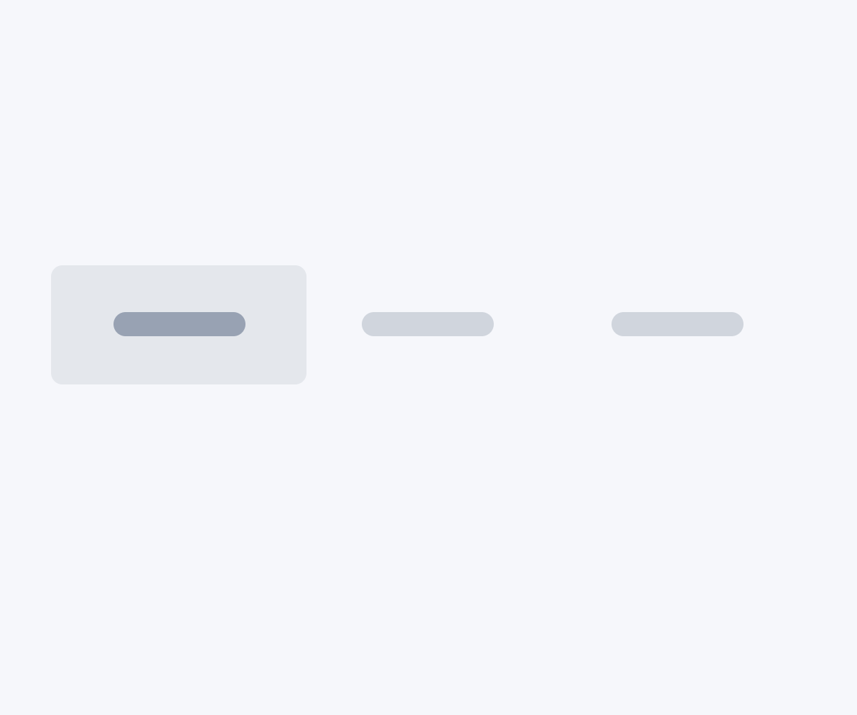
Tabs are useful for organizing and presenting different sections of content or information within a page.
Text inputs allow your users to enter letters, numbers, and symbols on a single line.
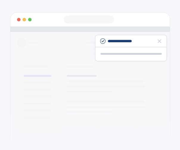
A toast notification is a lightweight popup message that appears temporarily over the main interface to provide brief feedback, notifications, or error message to the user.
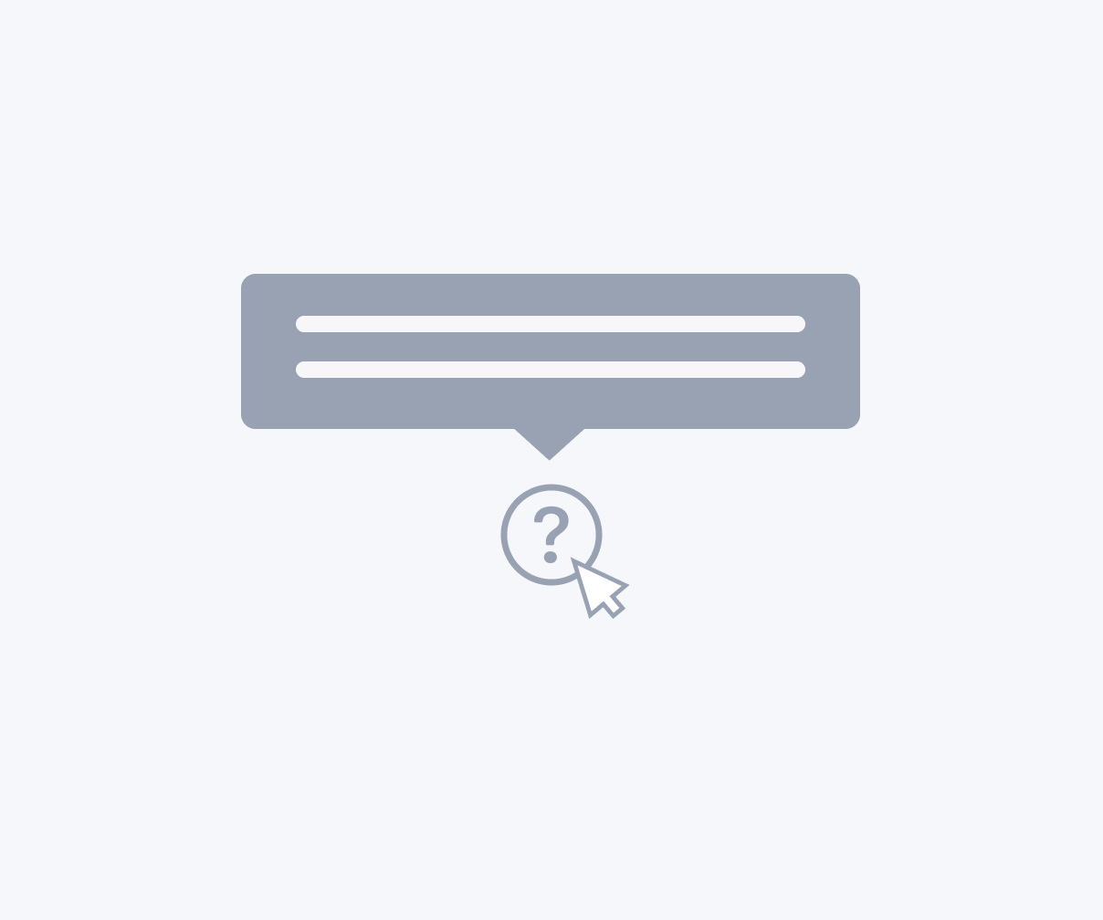
Tooltips display more information when users hover over, focus on, or interact with an element.